
Case study · 11 September 2026
AzzaProd
From UX audit to OVH deployment: a bilingual studio portfolio redesign that puts the work first and makes it easier to get in touch.
- Format
- Studio portfolio redesign
- Role
- UX audit · Design · Full-stack
- Status
- Deployed and maintained
Technologies
- Next.js
- React
- TypeScript
- i18n
- OVH
- SMTP
My contribution
What I built.
- 01
The studio’s films and images take centre stage from the homepage
- 02
The team can add new projects in French and English without rebuilding each page
- 03
The form preserves entered text if submission fails and offers a direct email address
- 04
The website is deployed on OVH and connected to the studio’s domain and email service
- 01Put the studio’s work first
Reorganise the content and simplify the interface to give films, images and the team room to stand out
- 02Structure a bilingual portfolio
Separate content from presentation to support new projects in French and English
- 03Help visitors recover from form errors
Validate information, preserve entered text if submission fails and offer a direct email address
- 04Take the website into production
Configure the OVH server, domain and email service to deliver a live website with ongoing maintenance
Turn an initial concern into a project direction
AzzaProd’s founder had a website built from a template. The studio’s work took a back seat: navigation, copy and decoration drew attention away from its films and images.
We spent an hour reviewing the site together. I identified distracting elements and information that was difficult to find. That audit turned his concern — “the site does not reflect who we are” — into a clear direction. He then entrusted me with the website’s redesign and deployment.
Make the work the starting point
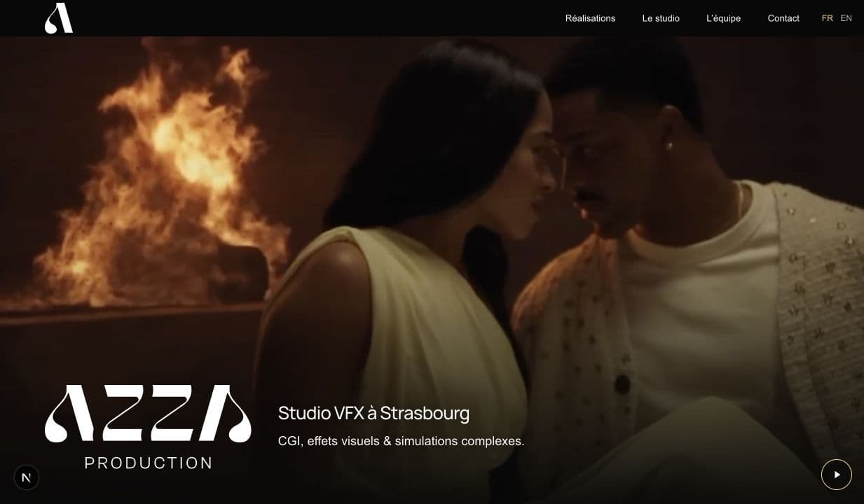
I reorganised the content and simplified the interface to put the studio’s work first. Projects, the studio and the team each have a clearly defined place, with navigation and layouts adapted for phones through to large screens.
The homepage video introduces AzzaProd’s visual identity. A playback control lets visitors pause it, giving them control over motion as they explore the website. This connects the visual direction with practical considerations about comfort and usability.
Make room for future projects
The studio needs to present new films, team profiles and projects in two languages. I separated content from presentation: one structure supports French and English, with independent wording for each version and projects that can contain images or videos.
This lets the studio expand its portfolio using existing layouts. New content fits into a consistent presentation across projects and languages, without requiring a separate page design for every addition.
Support contact enquiries when errors occur
I added validation in the browser and again on the server. If form submission fails, the entered text stays on screen and a direct email address provides another way to reach the studio. Visitors can continue with their enquiry without having to rewrite their message.
Deploy and maintain the website
I installed the application on the studio’s OVH server, prepared it for production and connected the form to the email service. I also configured the domain so the website and email could operate together.
azzaprod.com is now live and maintained. This project brings together the responsibilities I want to take on in a full-stack team: clarify requirements with a client, translate UX decisions into code and follow through to production.